Welcome to SaaS Brew, a daily newsletter where we share useful SaaS tools and workflows for founders, builders, and small business owners.
Each edition highlights one product, explains what it does, why it matters, and who it is for. No hype. Just tools worth trying.
Today's brew looks at a problem that slows down every presentation, report, and pitch deck:
You have data that needs to tell a story. Sales trends, customer growth, budget comparisons. But turning numbers into visuals means opening a spreadsheet, choosing the right chart type, formatting axes, adjusting colors, and fixing labels until everything looks clean. It takes longer than it should.
You try templates, but they need manual tweaking. You copy from old decks, but the formatting breaks. You ask a designer, but they are busy. What should take two minutes stretches into twenty, and you still end up with graphs that look generic or hard to read.
You need clear, accurate graphs that match your brand and make your data easy to understand. You need them fast, without fighting with Excel or hunting for the right chart style. You need visuals ready to drop into a deck without the formatting headache.
That is where AI Graph Generator fits in.
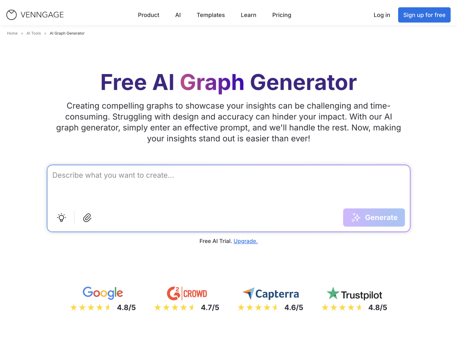
AI Graph Generator turns raw data into presentation-ready graphs in seconds using plain language prompts or pasted inputs. No spreadsheet setup. No manual formatting. Just describe what you want or paste your data, and the AI picks the right graph type, labels everything correctly, and delivers a clean visual you can customize. Built for business teams, educators, and analysts, AI Graph Generator removes the friction between having data and showing it clearly.
Who it is for:
Founders building pitch decks who need clean visuals without design delays
Marketing teams creating reports with performance data and campaign metrics
Analysts sharing insights with stakeholders who need clarity over complexity
Educators preparing lesson materials with charts students can actually read
Small business owners tracking growth and presenting results to partners or clients
Common use cases:
Turn monthly revenue trends into a line graph for investor updates
Generate a bar chart comparing product performance across regions
Create a pie chart showing budget allocation for team planning meetings
Build an area graph tracking website traffic growth over six months
Visualize customer retention data for quarterly business reviews
What it does:
It converts plain language prompts or pasted data into accurate, labeled graphs instantly
It detects the best graph type based on your data structure and intent
It applies proper scaling, axes, and legends automatically for clean visuals
It lets you customize colors, fonts, and layout to match your brand style
It generates bar graphs, line graphs, pie charts, and area charts from one tool
Why it stands out:
It eliminates spreadsheet setup and manual chart formatting entirely
It reduces errors by handling scaling and labeling with AI precision
It speeds up data visualization from minutes to seconds
It makes insights accessible to any audience with clear, professional graphs
Quick take:
If you are tired of wrestling with Excel every time you need a graph, AI Graph Generator could give you back those lost minutes and better-looking visuals.
More tomorrow in SaaS Brew ☕

